Picture desk
How editors choose the lead image
The lead image is the only part of a story most readers will see. It appears in the feed, in the share card, on the section page and at the top of the article, and in three of those four places it is doing its work without the headline…
Written and checked by the Picdar editorial desk
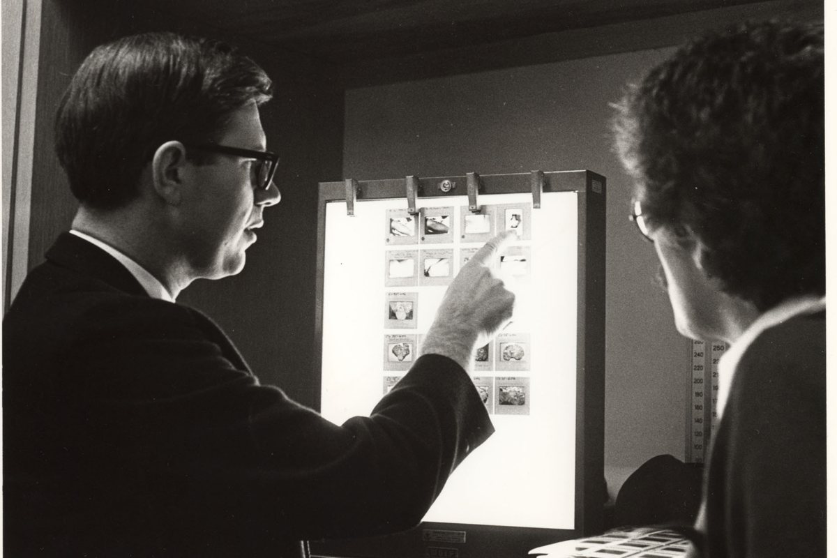
Choosing it is not a question of which photograph is best. It is a question of which photograph carries the story at the sizes the story will actually be seen.
Information before appeal
The first filter is what the frame tells a reader who has not read a word. A portrait of the person the piece is about tells them the piece is about a person. A wide shot of a building tells them very little, however well made it is.
Ask what the reader learns in the first second. If the answer is "there has been an event of some kind", the frame is decorative and belongs further down the page. If the answer is "this specific person, in this specific situation", it is a lead candidate.
This filter disposes of most of the shortlist quickly, and it disposes of the prettiest frames more often than editors expect. A beautiful photograph that illustrates the subject in general rather than this story in particular is a stock image with a better provenance.
The moment inside the frame
Among the frames that carry information, the lead is the one holding a moment: an expression, a gesture, an interaction, a piece of action that has a before and an after.
Moment is what makes a reader stop. It is also what survives compression, because a face mid-reaction remains legible at two hundred pixels wide while a composition of subtle balance does not.
Where there is no moment available — and often there is not — a clean, close, well-lit portrait outperforms a busy scene. Editors reach for the busy scene because it feels more journalistic. At card size it is noise.
Size is a constraint, not an afterthought
A lead image has to work at full width, at card width on the section page, and as a square or 1.91:1 crop in a share card. Those are different pictures.
Test the shortlist at the smallest size before deciding, not after. A frame whose subject is a small figure in a large landscape loses the subject entirely in a thumbnail. A frame whose subject fills half the height survives every crop.
Orientation follows from placement. A tall frame makes a poor full-width lead and an excellent in-article image. A wide frame crops badly to square. If a story will run across several placements — and most do — the frame that degrades most gracefully is worth more than the frame that peaks highest in one of them.
Setting a focal point on the asset, once, at ingest, removes most of this problem. Every downstream crop then keeps the subject centred, including the crops made by systems the desk does not control.
The crop is part of the choice
Two candidates that look different may be the same frame cropped two ways, and two frames that look similar may separate entirely once cropped.
Crop for emphasis: cut to the thing the story is about. Crop out what distracts and keep what explains. The distinction matters, because the elements that distract at full width — a second person, a sign in the background — are frequently the elements carrying the context.
Where a crop changes what the reader would conclude about the scene, it has stopped being a design decision. Either keep the wider frame or say in the caption what the frame excludes.
The checks that come before the choice
Before a frame becomes a lead it needs to clear the same three gates as any other published picture, and the lead attracts the most attention, so it clears them first.
Is it licensed for every placement it will appear in, including the social card? Is everybody in it correctly identified? Is it what it appears to be, or is it a composite, a handout, or a reconstruction that needs labelling?
A lead that fails one of these after publication is the most expensive picture on the site, because it is also the most widely copied.
What we do not do
We do not lead with a frame because it is the newest. We do not lead with a frame because the photographer is on staff. We do not lead with a frame because it is the only one that fits the template.
And we do not use the lead to make an argument the article does not make. A photograph chosen to imply something the reporting did not establish is an editorial claim without a byline.
Conclusion
The lead image is chosen on information first, moment second, and behaviour under cropping third — in that order, and with the rights and identification checks passed before any of them. A frame that survives those tests will rarely be the most striking one on the shortlist. It will be the one that still means something in a feed, which is where the reader is.